FliteDeck Pro - ETOPS
Overview
FliteDeck Pro is a mobile application (iOS & Windows) used by commercial pilots in the cockpit. When flying over large areas without suitable airports for diversion, pilots must comply with Extended-range Twin-engine Operational Performance Standards (ETOPS). Regulations specify how far away from an airport an aircraft can be – some airlines must stay within 60 minutes, while others may be approved for 180 minutes or more.
The existing ETOPS feature displayed preset “rings” around each airport, but it created cluttered maps and lacked flexibility for daily operational changes. My role was to lead the redesign of this feature to reduce clutter and increase flexibility while maintaining safety-critical clarity.
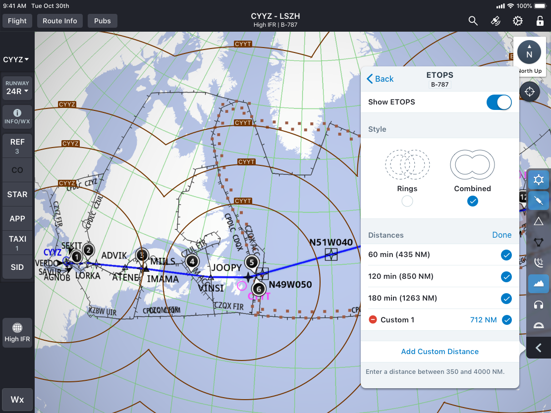
Final ETOPS rings displayed on the Enroute map, showing the redesigned Combined view.
Discovery & Research
I conducted interviews with Product Management and airline pilots to understand where the initial implementation fell short. We uncovered two key pain points:
Overlapping ETOPS rings cluttered the map.
Preset ring values (60, 120, 180 minutes) were too inflexible for real-world operations, where ETOPS distances often change based on weather or flight plans.
Due to COVID-19 restrictions, I led a pivot from in-person simulator testing to virtual, scenario-based usability sessions with airline customers. This ensured we continued gathering critical user feedback despite constraints.
Original ETOPS implementation – preset rings around multiple airports cluttered the pilot’s view.
Ideation & Initial Design
To reduce clutter, I introduced an alternate display option where intersecting lines between rings were hidden (“Scalloped Mode”). I also added functionality for pilots to hide individual rings and to set custom ETOPS distances beyond the presets.

Comparison of early design explorations - standard rings vs. scalloped view for decluttering the map.
Testing & Iteration
In virtual usability testing, I facilitated pilot sessions using clickable prototypes and scenario scripts I developed. These sessions revealed three main issues:
“Scallop” terminology was unfamiliar.
Pilots were unsure if values applied to their specific aircraft.
Pilots preferred entering ETOPS in nautical miles (NM) rather than minutes.
I iterated the design to address these findings:
Renamed “Scallop” to “Combined” and added pictograms for clarity.
Leveraged existing fleet tags to show which aircraft the ETOPS values applied to.
Switched custom entries to NM, with validation for reasonable ranges (350–4000 NM).
Design Evolution & Final Design
The final design allowed pilots to:
Toggle between Rings and Combined views.
Enter custom ETOPS distances in NM.
Hide or display rings as needed for decluttering.
This flexibility gave pilots control while maintaining regulatory compliance.
Final selector UI - streamlined options with clear terminology and custom distance entry.
Implementation & Outcome
I created a detailed behavioral specification for developers, ensuring implementation aligned with pilot workflows and error states were handled safely (e.g., invalid distance entry).
The feature was well-received in customer feedback:
“Loving the new combined ETOPS rings view. Our crews will love it now that we are crossing the pond. They are going to be so anxious to see [it] in the next build.”
Pilots reported reduced map clutter and greater confidence in matching ETOPS distances to their flight plans in real time.
Leadership & Influence
Beyond design execution, I played a key role in navigating research constraints during COVID, adapting methodology to ensure we still delivered validated solutions. I also facilitated cross-functional alignment, balancing pilot feedback, industry conventions, and product management requirements. My detailed specification and partnership with engineering enabled a smooth implementation of this safety-critical feature.